PACKAGE DESIGN
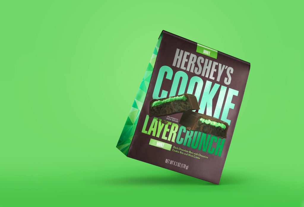
The package was designed to be familiar but new. We respected the iconic nature of Hershey’s while introducing a bold, playful attitude to match the new, surprisingly crunchy product experience.
goDutch helped launch Hershey’s Cookie Layer Crunch, the biggest news for this iconic chocolate brand in over a decade. Cookie Layer Crunch is a surprising twist on a familiar favorite. Or, as we like to say COOKIE-CRUNCH-TAS-TIC.
In partnership with Hershey Global Design, goDutch designed the package to be familiar but new, to appeal to consumers who fondly recall Hershey’s from their childhood, but crave more exciting snacks today. We respected the iconic nature of Hershey’s, while introducing a new, bold attitude and playful graphics to match the surprisingly crunchy product experience.
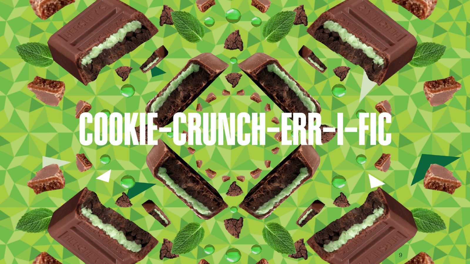
We created a series of off-pack visuals to celebrate the product ingredients and break through the chocolate category. From a kaleidoscope of ingredients, to a macro view of the fully-loaded crunchy, creamy filling, the key visuals were used across retail, digital and social media, making for a CRUNCH-TAC-U-LAR launch.
Appropriately launched on National Cookie Day, December 4, 2016, the product has been flying off shelves and is on its way to becoming consumers’ favorite crunchy Hershey’s treat.
The package was designed to be familiar but new. We respected the iconic nature of Hershey’s while introducing a bold, playful attitude to match the new, surprisingly crunchy product experience.

